How to Make the Most of Your Photoshoot with Me (The After-Plan)
Hi, I'm Cortney.
Lifestyle blogger, photographer, mother to my son Boden and frenchie Smalls, wife to my hubs Trevor. I built this space in an attempt to inspire you to find your edit and empower you to create the life you desire. Through digital content and honest storytelling, I hope to guide you along the way. Because everyone has an edit, and I'm here to help you find yours.
Get To Know Me
Categories
01. Style
02. Life
03. Wellness
Up Next:
So we just had the most amazing photoshoot — YAY! Thanks for trusting in me to capture you. In order to get the most out of this experience (not to mention bang for your buck), I encourage my clients to reference my “How to Make the Most of Your Photoshoot with Me” series — starting with “Before”, “During” and now — “After”.
This post will give you tips and workflows that I’ve learned and use on my own as a blogger and taker of many, many photos in an effort to help you feel empowered to use your photos to the best of your ability. If you’re a business/brand owner, this post is def for you. If we just took some photos for your profesh profiles or your fam, feel free to read through organization to help you get situated with your images.
Outline
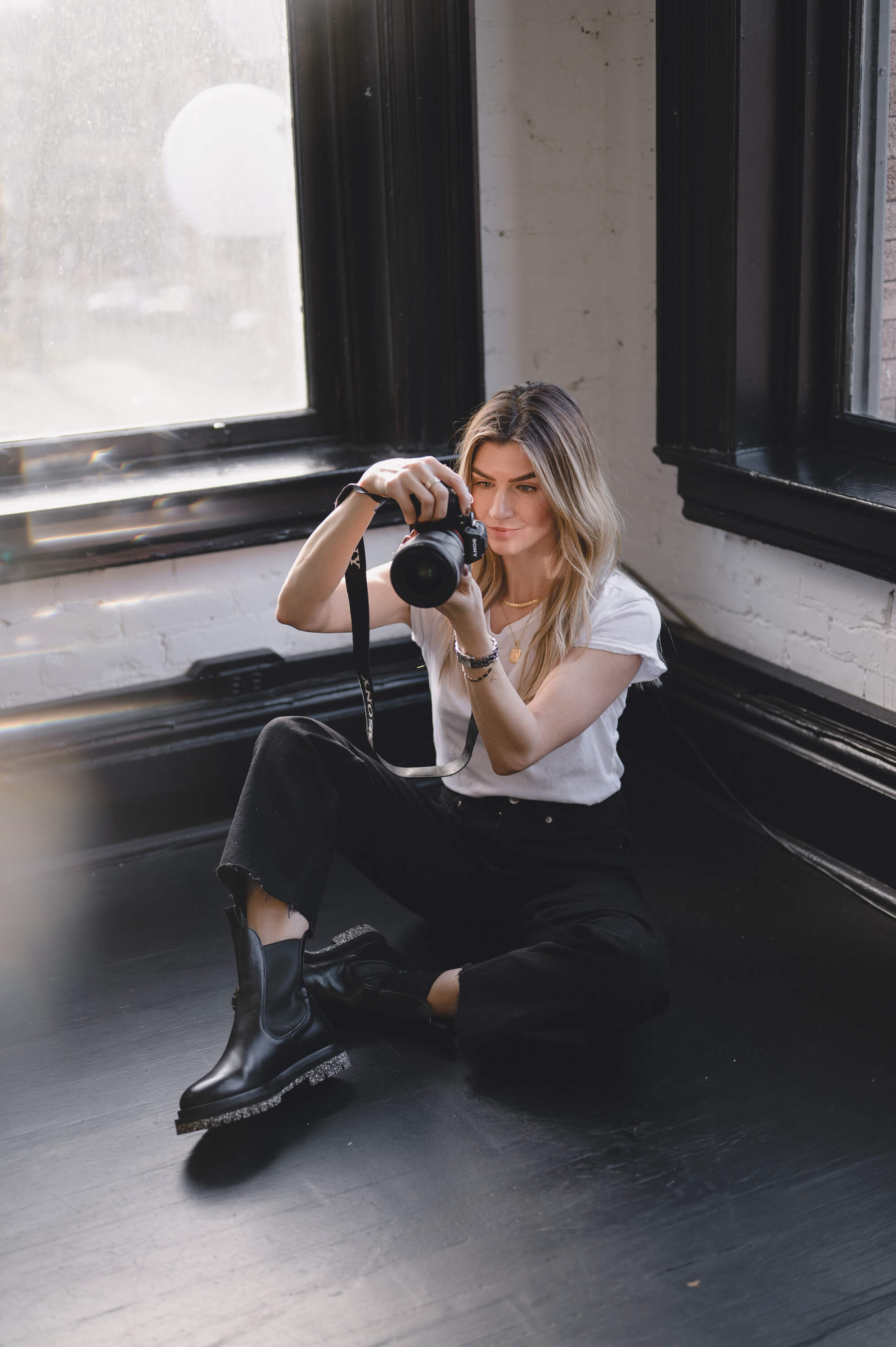
Receiving Your Photos
Here’s what you can expect with receiving your photos from me and how to transfer them into your world.
Sneak Peek
After your photo shoot is complete, you can expect to receive a sneak peek via text of a handful of images within one week. I’ll check in to see how you’re liking the editing and get you excited for more. Definitely encourage any feedback here. Warmer than you’d hoped? Was hoping for moodier? Tell me now.
Online Gallery
Within two weeks you’ll receive an email with a link to an online gallery delivered from Pixieset. In the case you don’t see this email, be sure to check your spam as it’s coming from “mailer@pixiesetmail.com”.
Download
In the email, you’ll see a 4 digit PIN at the bottom that you’ll need in order to download your photos. You can download your gallery as a whole or photos individually one by one. I recommend downloading your gallery as a whole and saving to your computer right away as your gallery will only be live for 6 months.
Note on file size : You will have the option to choose a download size “high resolution” vs “web size”. I recommend downloading in high res only if you plan to print as they’re very large files. If you plan these photos for online use only, downloading your gallery in web size is recommended and more than sufficient for your needs. If you’re planning a hybrid of printing a few and publishing the rest online, download those print photos individually or just download the gallery in both high res and web so you can make the decision later.
Favorites List
You’ll have the option to favorite photos within your gallery and I recommend doing this within Pixieset vs on your own after downloading. I say this because it’s easy to browse through this way and you can edit and save your favorite list at any time. If you tend to get overwhelmed with too many photos, go through your gallery once picking faves. Then go to your favorites list and remove any you don’t like on the second pass. You can then download this set so that you have less to work with off the bat. Note, you can create more than one list — so maybe there’s one of “candids” vs “smiling” or “studio” vs “outside”.
Organization
On the topic of overwhelm, take it from someone who takes and has a lot of photos… organization is a must. Regardless if you’re a blogger who has photos taken regularly or a mother who just had a family photoshoot — keeping your photos organized will allow you accessibility and enjoyment.
Here’s how I organize my photos after each shoot (via my apple devices)–
Computer
The images on your computer should be organized for storing and using on your website, email marketing and any marketing material creation (like using Canva):

- create folder for images (ex: “21.05.20 | Branding | The Grey Edit | Studio”)
- download full gallery in high res, add it to “high res”
- download full gallery in web size, add it to “web size”
- download favorites list, add to “faves”
- create the “print” folder only if you plan to print — copy any you’d like to print into that folder and make sure they’re high res
Note: the “assets” folder can be used if you’re a business/brand and will be creating assets through a site like Canva with your images.
Phone
The images on your phone should be organized for using on social media:
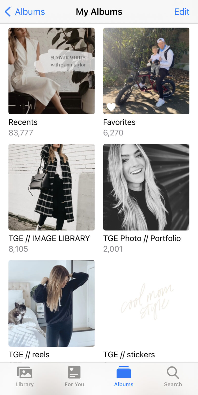
- airdrop faves from computer to phone (all my phone photos upload to cloud so this also ensures they’re there)
- add images to album on phone (ex: “TGE Image Library” is what I use to house all edited images I wish to use on my instagram)
Creating Assets
If you’re a business or brand, you might want to use your photos to create assets to use for marketing and on your website, email and social. I use Canva and Unfold to create for my brand, The Grey Edit and business, The Grey Edit Photo.
Canva
Canva is an amazing platform that allows you to be a graphic designer without actually having to hire a graphic designer. Endless templates and options at your fingertips. I have the pro version and use their brand kit feature which allows me to upload my logos, colors and fonts specific to my brand. This way, any asset I create maintains a cohesive aesthetic (essential to branding).
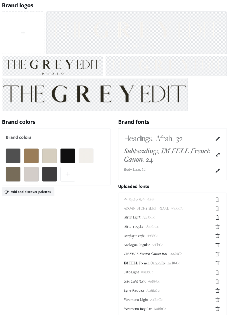
For The Grey Edit, I create insta post graphics, reels & igtv covers and my media kit. For The Grey Edit Photo, I create my investment guides.
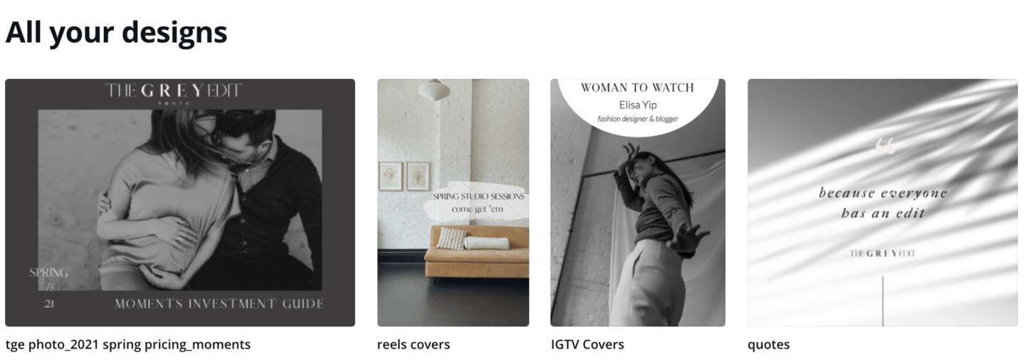
After a shoot, you can upload a handful of fave images you’s like to create assets with. Because I am taking photos so often, I just pull from my favorites folder when I’m ready to create something. I have the desktop and app version of Canva so depending on where I create, I just pull from the appropriate folder.
Unfold
Unfold is one of my favorite apps for storytelling — I use it to create insta story graphics that have an editorial vibe. I have the pro version so I can take advantage of their brand kit feature too, allowing me to upload my logos, colors and fonts specific to my brand.
Unsplash is a free image library that’s integrated with Unfold so in addition to using the photos from our shoot, you can use other high res, beautiful images and backgrounds to convey a story.
Planning Posts
If you’re a business or brand, it’s highly recommended you plan out your content for posting on social. I use Planoly to plan my instagram.
Planoly
After a photoshoot, I like to assess my favorite photos and divide up into groups to be used to tell stories on instagram. This often comes in two ways:
- photos that have stories: maybe i held flowers in a photo, or am sitting with my laptop. i’ll likely want to talk about those items in the photo and communicate a message from there.
- photos that need stories: if there are no props, i’ll group between 3-5 photos in a set to be shared via a carousel. i’ll divide these sets by look and pose/location so that i can pulse them across my feed over time. then i’ll think of a story at a later time and date when i’m ready to post.
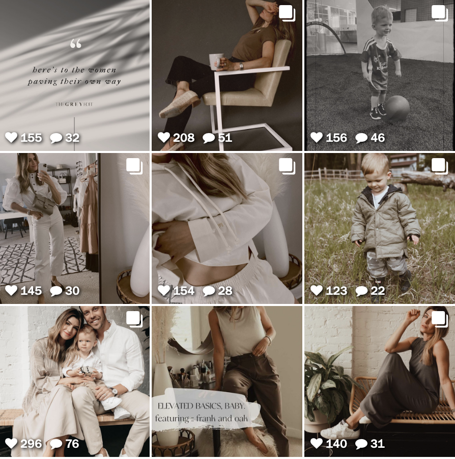
It’s so helpful to do this right after a shoot so that whenever I look at my Planoly, I know all the images I have to play with on insta. Same goes for after creating an asset on Canva, I’d drop the asset here so I know I can use it and move around to my liking.
Having a balanced feed is important to me and I love using Planoly for this visual check. I don’t like posting two sitting photos right next to each other and if I’m with another person, I’ll try to pulse those out as well. Same goes for coloring — I don’t like two photos in the same outfit near each other, nor do I like the same setting too close to each other. If I pop in a reel with a copy overlay cover or a graphic, I want those to be extra pulsed. (That’s just me).
Maintaining an Aesthetic
That little bit of OCD I just disclosed there leads me into a very important bit for my brand/biz owners out there — developing and maintaining an aesthetic. I used to lay in bed at night losing sleep over what I wanted my instagram feed to look like when I started out as a content creator. The photo I’d take on my iPhone looked crappy (which is why I ended up investing in photographers) and then when I did attempt to edit them, I couldn’t get the look I was going for.
So, now that you have the photos from our shoot, the key is to find a way to edit any additional photos you take and throw into the mix so that the vibe is cohesive and plays well.
There are two ways to go about this —
Using a phone editing app
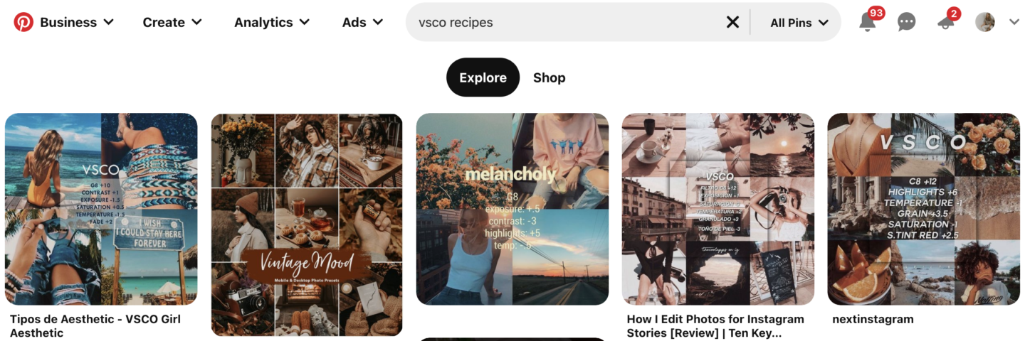
I love VSCO for editing photos and videos to a certain aesthetic. The secret not many know however is that rather than just applying “A6” filter in the app, you need to do a series of steps to create a desired look and feel to your photos. My advice for this is to search on pinterest “vsco recipes” and see if there are any you like. I tend to go for a brownish/creamy tone with a bit of mood. See what you like and then search for more of those. Once you find an exact recipe you like, recreate it on vsco following these steps. Then apply to all future photos/videos.
The Tezza app is another amazing editing app that allows you to choose a filter based on your aesthetic preference. A bit less involved than VSCO and a bit pricier. Her edits are definitely on-trend and worth exploring — especially with her video editing options. My faves are mood and vintage.
Using lightroom presets
Liking the way your photos turned out? I mean, hopefully obvs. Interested in buying and using as a preset for you to use? We can make that happen!
Years ago I created The Grey Edit Store to house my presets for anyone to purchase. These days, I’m an actual photographer using a much different set of presets that I’m excited to package up and share. While Volume 02 is under construction, please feel free to ask me for the preset I used on your shoot. I’ll export and provide you a desktop and mobile version along with instructions on how to install and use.
View full post on TGE Presets here
Using a filter for insta stories
Don’t forget the look and feel of your instagram stories — there are filters for those too! I recommend browsing the effects and saving a handful of those you like on your face and then on the environment around you. Ensure they play nice together and then use as you show up on stories on the daily.
SHARE THIS POST:
Leave a Reply Cancel reply
This site uses Akismet to reduce spam. Learn how your comment data is processed.
Meet The Blogger
Lifestyle blogger, photographer, mother to my son Boden and frenchie Smalls, wife to my hubs Trevor.
I built this space in an attempt to inspire you to find your edit and empower you to create the life you desire. Through digital content and honest storytelling, I hope to guide you along the way. Because everyone has an edit, and I'm here to help you find yours.
Hi, I'm Cortney.
Get To Know Me
Mother. Wife. Blogger. Photographer. I built this space in an attempt to inspire you to find your edit and empower you to create the life you desire. Through digital content and honest storytelling, I hope to guide you along the way. Because everyone has an edit, and I'm here to help you find yours.
Hi, I'm Cortney
Learn More
Home
Style Formula
Shop
Contact
The Blog
Style
Life
Wellness
FAQ
COPYRIGHT @ 2022 THE GREY EDIT / WEB DESIGN BY CHLOE LEONARD STUDIO / PRIVACY
About
Subscribe
Sign up to become an insider of The Grey Edit and never miss a beat.
Hi Cortney,
Thank you for writing this thorough run-down! It was really helpful in organizing my next steps and providing a checklist of to-dos.